Refreshing Abacum's brand to speak to a new generation of finance leaders
An up-branding project to reposition a SaaS platform — financial planning and analysis platform that helps companies manage forecasting, reporting, and decision-making in real time.
Company: Abacum | Role: Brand Designer | Scope: Brand Identity, Design System, Strategy
1. Context
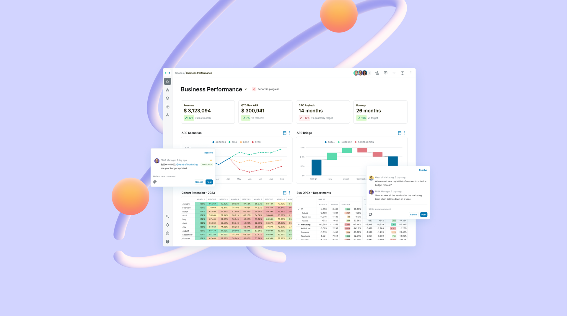
Abacum is a financial planning and analysis platform that helps companies manage forecasting, reporting, and decision-making in real time. It’s built for a new generation of finance professionals—CFOs and FP&A analysts who operate in tools like Notion and Slack, and expect the same level of usability and design from their finance stack. Instead of traditional enterprise software, Abacum positions itself as a modern, intuitive SaaS product for finance teams.
When I joined, the product was growing quickly, but the brand was no longer keeping pace. The visual identity—particularly color and overall style—was not fully aligned with its audience, and presented readability challenges.
This created an opportunity to evolve the brand into a more mature, accessible, and concept-driven system—one that better reflected the product’s direction and leveraged a stronger visual metaphor.
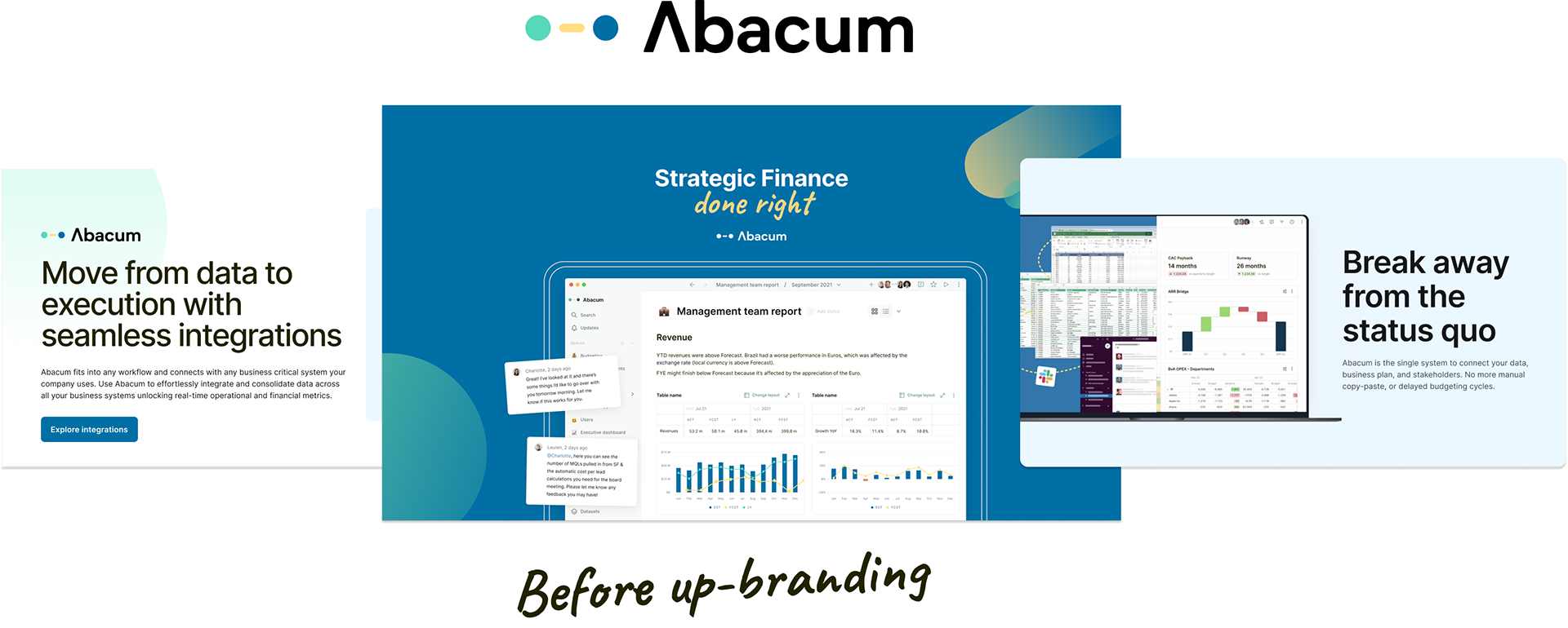
The brand lacked a clear differentiation within the competitive landscape, relying on a more traditional visual language that didn’t reflect the product’s innovative nature.


2. Research
Understanding the audience before touching a single pixel
At Abacum, the brand evolution was driven by continuous evaluation and alignment with the company’s strategic direction. As the product scaled, it became essential to reassess how the brand was performing—both visually and in terms of perception.
We approached this phase through a combination of internal alignment, market analysis, and user insight.
Internal alignment
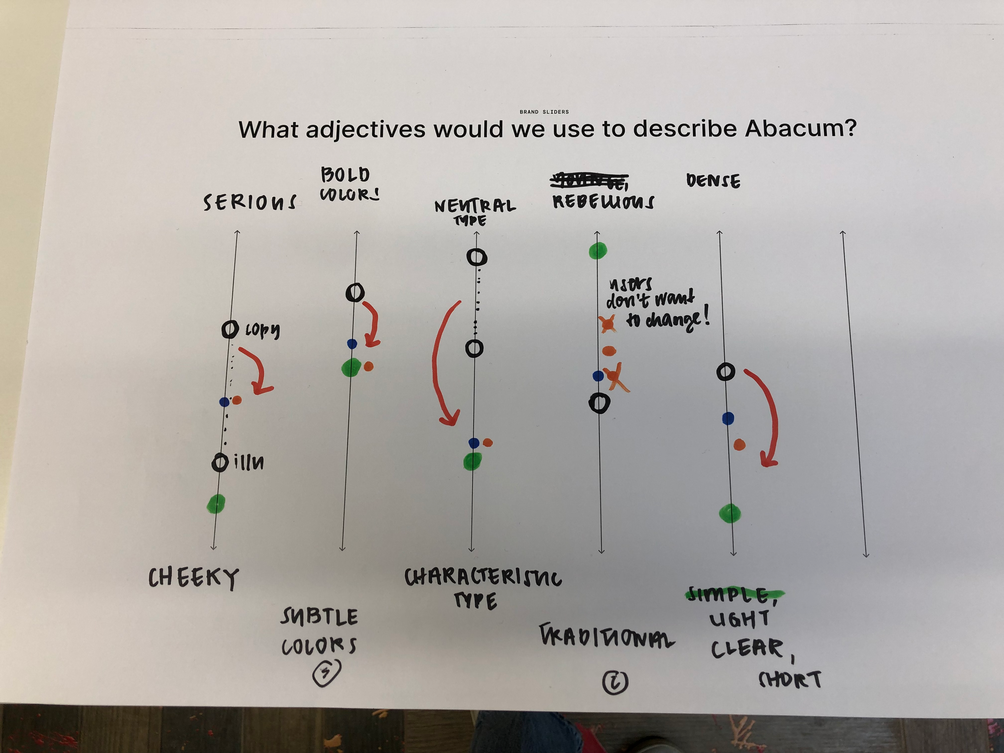
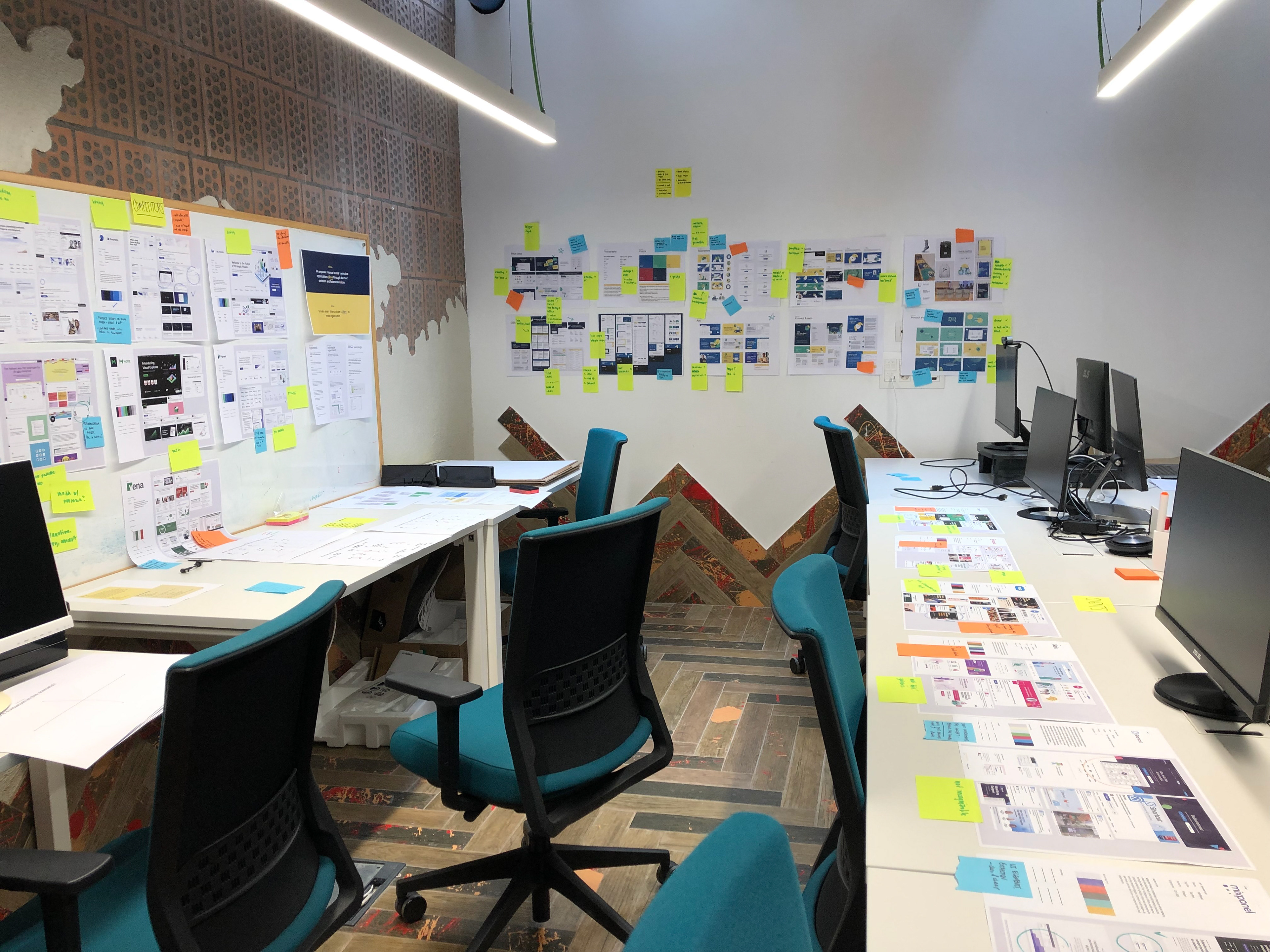
I facilitated two in-person workshops with leadership—including Design, Marketing, and Founders—to define the desired brand personality and evaluate the current state of the identity.
These sessions helped surface key tensions, align on business goals, and establish initial hypotheses around how the brand should evolve to better reflect the product and its audience.
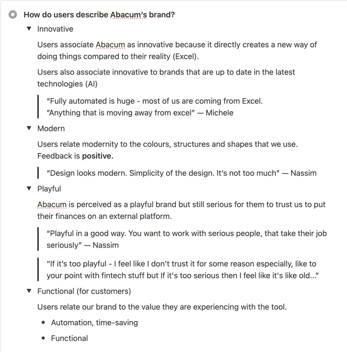
As a result, we aligned on a set of core brand attributes: human, helpful, innovative, and leading—while remaining playful without feeling childish.
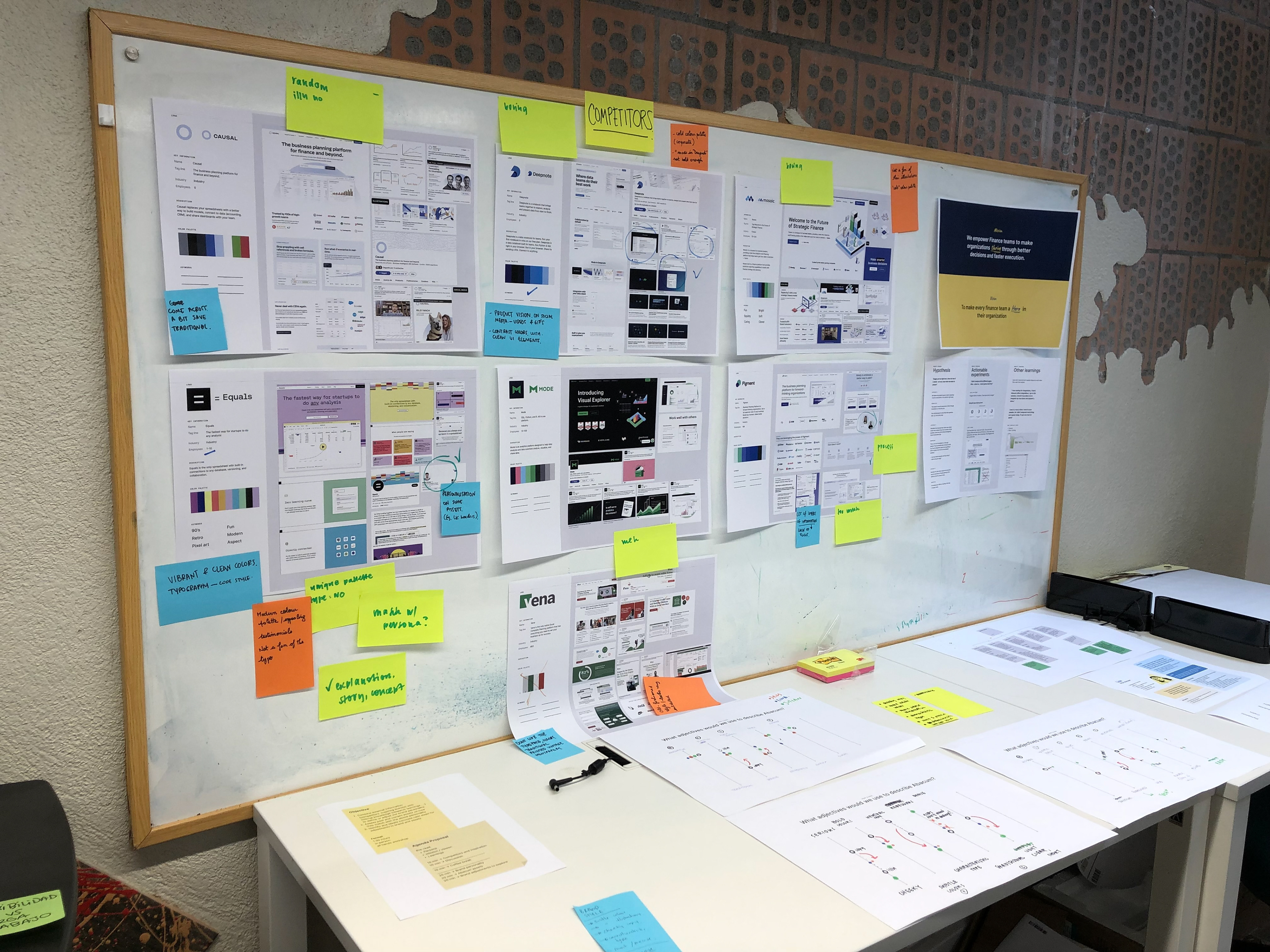
Competitive Landscape
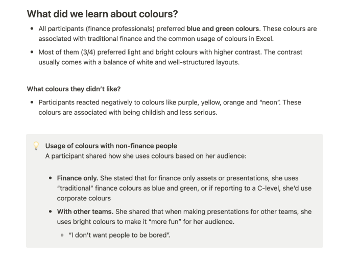
We conducted an analysis of 20+ competitors across the financial and SaaS space to understand visual patterns, positioning strategies, and category conventions.
The landscape revealed a strong reliance on blue and green palettes and a generally conservative tone—highlighting a clear opportunity for differentiation through a more expressive and modern visual language.

User perception
To ground our decisions in real user insight, we conducted 5 qualitative interviews focused on brand perception.
These conversations surfaced four key factors influencing engagement with the brand:
- relatability
- trust through visual identity
- product experience
- interactions with the company
They also revealed a gap between how innovative the product felt and how the brand was being perceived—helping validate the need for a more aligned and expressive identity.
Ongoing evaluation
Alongside these activities, we continuously monitored the performance of visual assets and website updates, using both qualitative and quantitative signals to inform iterations and ensure the brand evolved in alignment with user behavior and business goals.


3. Strategy
Strategic foundation
Following a cross-functional alignment phase, we defined a clear set of brand attributes to guide the redesign: thought-leading, trustworthy, human, helpful, innovative, and empowering.
These principles served as the foundation for building a brand that could better reflect the product’s ambition and resonate with a new generation of finance professionals.
Narrative framework
To ensure clarity and consistency in communication, we applied the StoryBrand framework—placing the customer at the center of the narrative and aligning messaging around their goals, challenges, and motivations.
This framework helped unify messaging across product, marketing, and brand touchpoints—ensuring the value proposition was clear and immediately relevant.
Concept & visual metaphor
To translate the brand strategy into a distinctive visual language, we explored a series of metaphors that could embody both the product’s functionality and its forward-looking vision.
We built on the origin of the name Abacum, derived from the abacus—an ancient calculation tool—and reinterpreted it through a modern lens.
This metaphor became the foundation of the visual system:
from static tool → to dynamic system
from manual calculation → to automated intelligence
The abacus elements were abstracted into a flexible set of visual components, forming a system that reflects structure, movement, and transformation—bridging the legacy of finance with its future.
This strategic foundation informed the development of a modular visual system, translating the metaphor into a contemporary and flexible design language.

4. Solution
The new visual language
The ancient abacus, dating back to 300-500 BC, was a revolutionary device that has left a lasting impact on history by contributing to the development of mathematical knowledge.
Inspired by this remarkable tool, Abacum draws its name and visual identity from this legacy. Introducing Abacum, the next-generation abacus.
Inspired by this remarkable tool, Abacum draws its name and visual identity from this legacy. Introducing Abacum, the next-generation abacus.
Abacum represents the evolution of strategic calculation tools, seamlessly combining the timeless appeal of the traditional abacus with futuristic design and state-of-the-art technology.
While the ultimate goal remains the same - to enable financial professionals to obtain accurate numbers - Abacum's core components remain the same: Beads/Spheres and Rails/Strings/Paths, but enhanced for the modern era.
While the ultimate goal remains the same - to enable financial professionals to obtain accurate numbers - Abacum's core components remain the same: Beads/Spheres and Rails/Strings/Paths, but enhanced for the modern era.
The visual system builds on the abacus fundamental elements, abstracted and expanded to support a more flexible and expressive language. Together, these elements form a cohesive visual language that balances structure and flexibility.
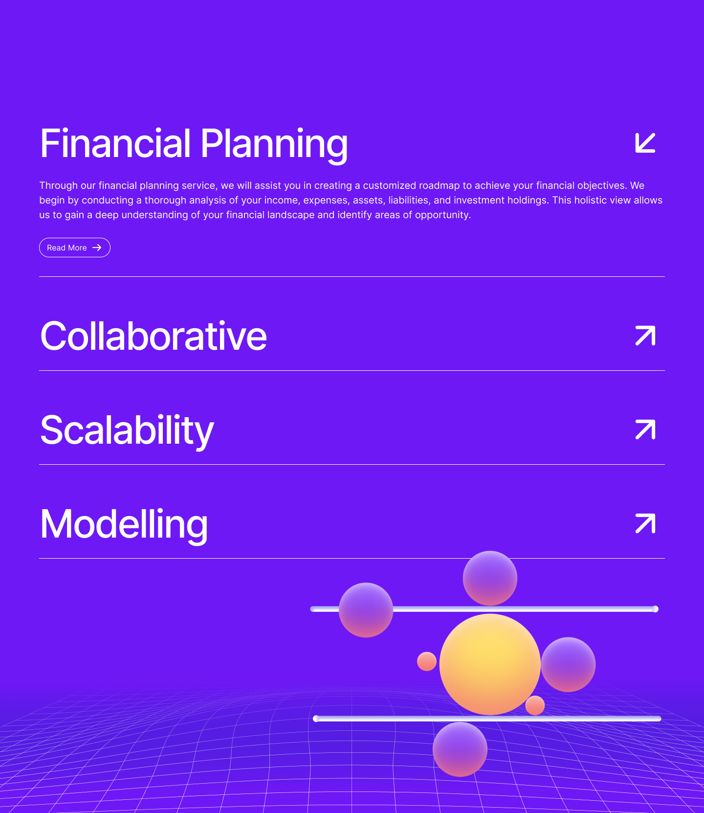
Beads
represent data, insights, and users—the core units of the system. They evolve from static elements into dynamic components, varying in scale, materiality, and behavior to reflect complexity and movement.


Paths
(derived from strings) represent strategy and decision-making. Reimagined as flexible, interconnected routes, they enable multiple directions and relationships, reinforcing adaptability and speed.
Frame
transitions from a rigid boundary to an open, scalable structure—shifting from two-dimensional constraints to a multidimensional system that reflects technology and growth.

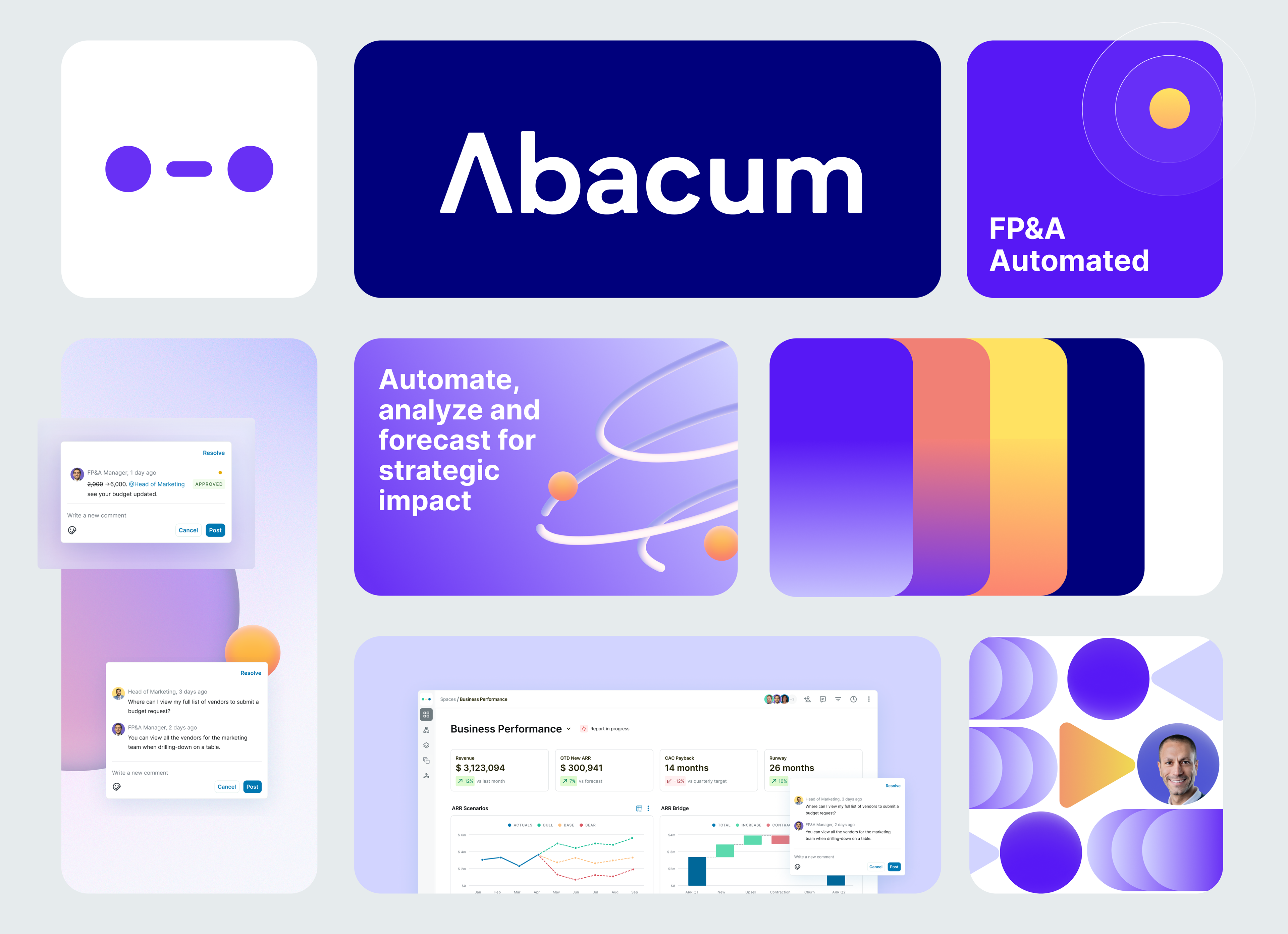
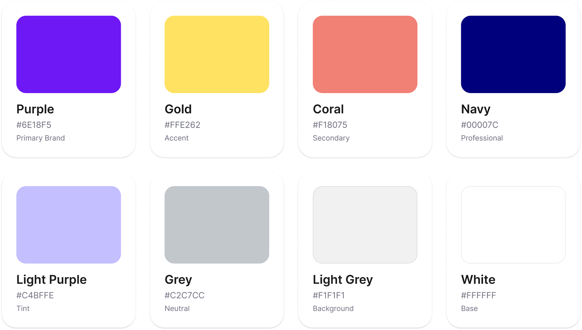
Color system
The previous palette relied heavily on blue and green—common across the financial SaaS landscape—reinforcing a more traditional and undifferentiated perception.
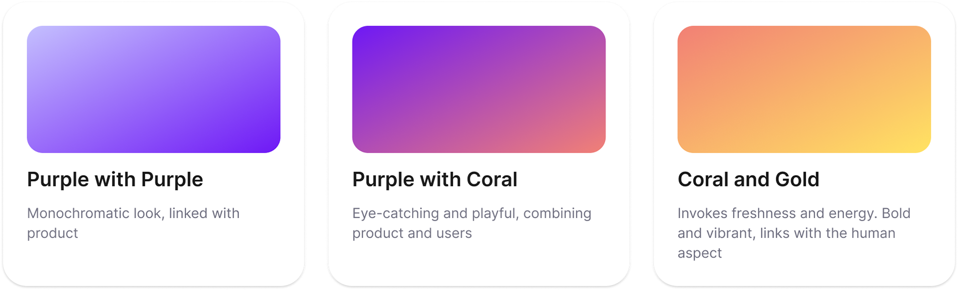
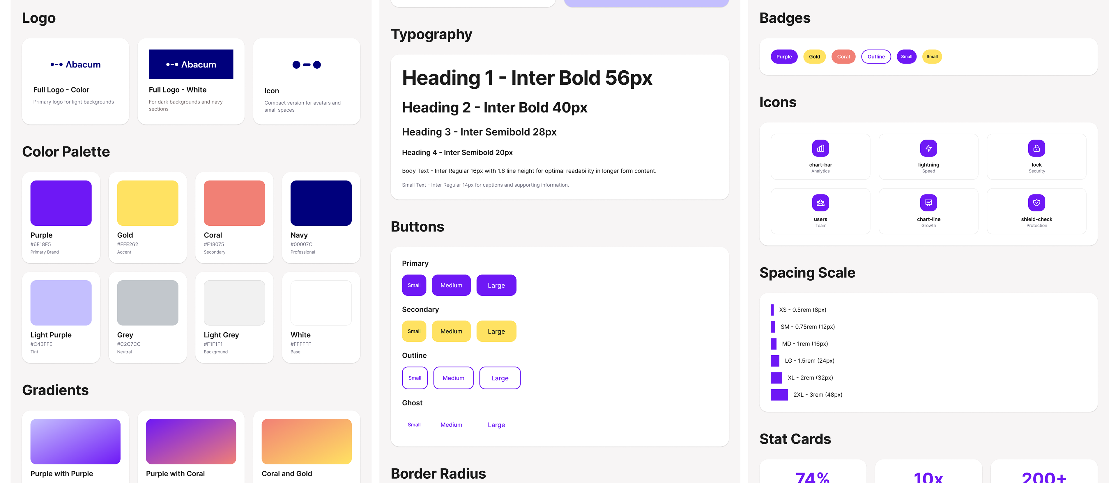
To reposition the brand, we introduced a more distinctive and expressive color system. A vibrant purple became the core, signaling ambition, intelligence, and a forward-thinking approach. It is complemented by a warm yellow to introduce energy and optimism, and a coral accent to bring dynamism and highlight key interactions. A deep navy anchors the system, providing contrast and maintaining a sense of trust and authority.
Together, the palette balances clarity and differentiation—moving away from conventional financial aesthetics while remaining credible and accessible.
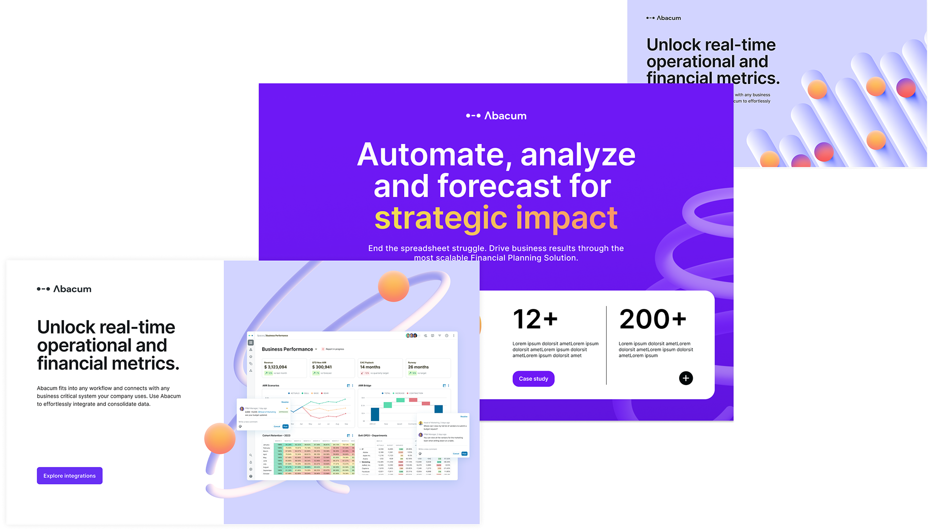
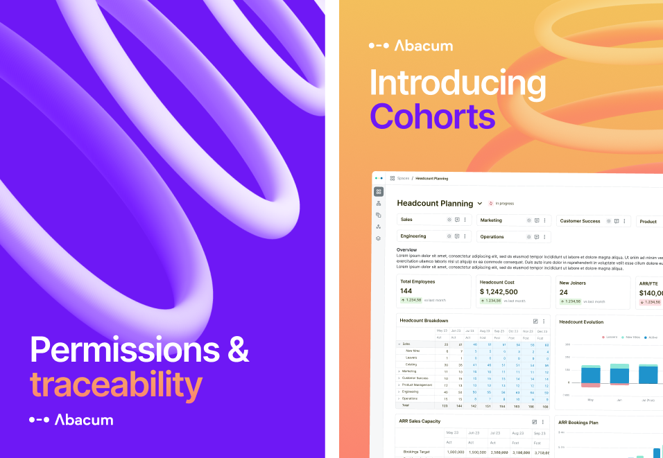
Brand in use


Design System
Building the system that scales the brand
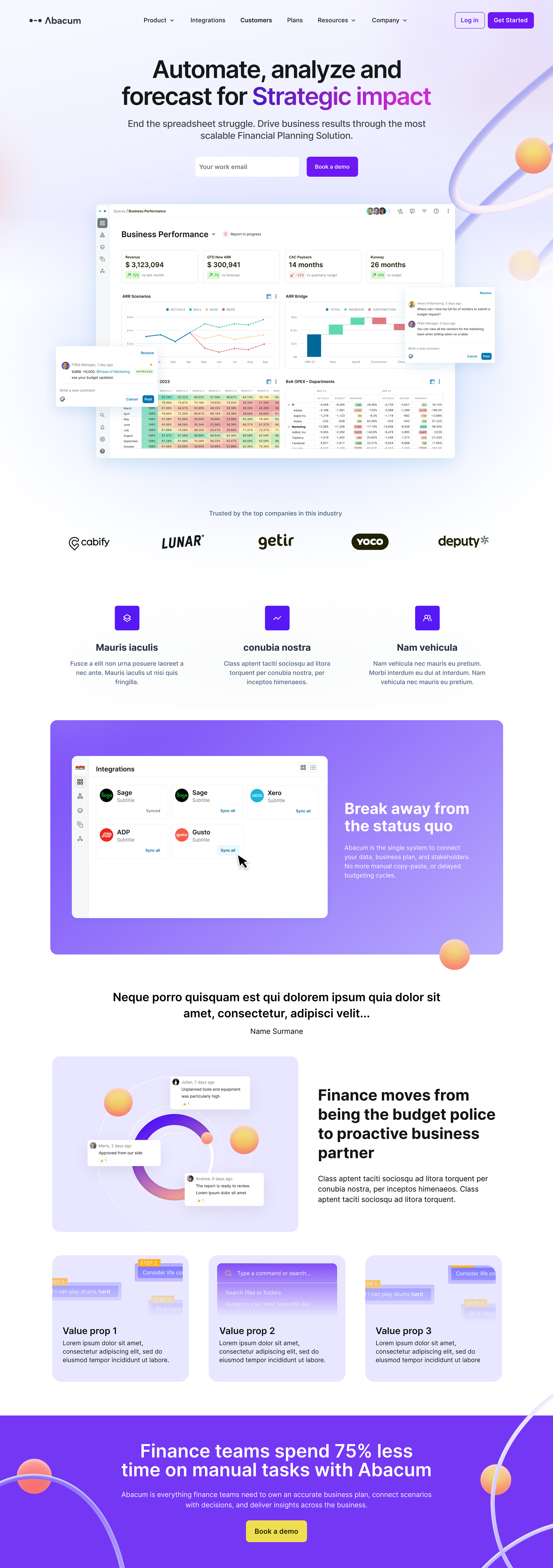
To ensure consistency and scalability across touchpoints, I developed a design system that translated the new brand identity and metaphor into a cohesive, usable framework.
The system brought the visual language to life while allowing for flexibility in expression—adapting its tone depending on the context. From more structured and conservative applications in product and website, to more expressive and dynamic executions in marketing channels such as social media and campaigns.
The refreshed brand launched in April 2024 and was rolled out across Abacum's website and marketing materials. The visual foundations defined during this project — including the abacus-inspired system and the purple-led palette — continue to shape Abacum's identity as it scales.
The brand has supported a period of significant growth, including a $60M Series B and expansion across multiple markets.